5 min read
Designing websites and apps for localization: things to remember
Anurag : Apr 13, 2020 5:26:59 PM


Localization is one of the most important strategies supporting customer expectations. Even though English is the most popular language used by websites, it’s certainly not the only one out there, so adapting digital products to the needs of local audiences isn’t just a nice gesture, but a must in modern eCommerce.
As early surveys showed, more than 70 percent of international consumers spend most or all of their online time on websites in their own language, so ignoring this requirement is a sure-fire way to fail at the international arena.
So, how to go about designing user interfaces in websites and other digital products for localization? This is the question that we’re going to address in this article.
Understand the implications from the beginning
Designing a digital product in a way that ensures localization without the need for revisions and redesigns is possible only if a product team understands all purposes of the final version. For example, if the goal is to design an international eCommerce website that will be used to sell products in multiple countries, the developers and designers should work together to identify implications that go way beyond translation.
These implications include, but are not limited to:
- Different amount of screen space needed to accommodate copies in the target languages
- Left-to-right flip for languages like Arabic and Hebrew
- Visuals that should be appropriate to target cultures.
So, design and localization come together in many aspects, and a lack of understanding of how to combine them can easily result in something that might be difficult to adapt or localize for international audiences. To avoid that, it’s absolutely necessary to have a series of meetings on localization implications for design so everybody is on the same page during the product development.
Designing digital products for international audience
Localization Implications: Websites
In this section, let’s review the best practices of designing websites for localization. As a designer, you should keep the following in mind when developing your next international product so localization wouldn’t be a problem.
1. Always Plan for Copy Growth
Translating a website copy, say, from English to Spanish can result in the target content taking 10 or even 30 percent more space than the original. Obviously, this could be a real problem for the owner of this website because it can ruin the visual appeal of the product.
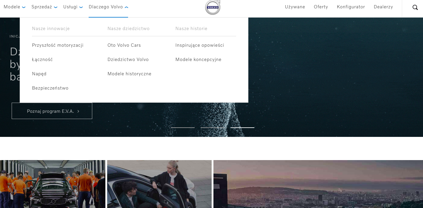
For example, let’s check out the difference in content length using a real website. The image below is an official website of the Swedish carmaker Volvo for Poland. Here’s the size of the last item in the menu in the Polish language.

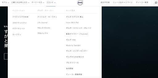
As you can see, the menu doesn’t take a lot of space, which can make one think that other the localized text in other languages will also have comparable size. However, this is not the case with all languages; for example, take a look at the size of the same menu item on Volvo’s official website for Japan.

World of difference, right? Not only the text is totally different, but also the Japanese version has to contain more menu items. If you don’t plan your design for it, there’s going to be an angry call from the customer.
Avoiding this requires UI designers to accommodate the largest version of localized content (or setting a word limit, which can be an option, too) as well as using a font that supports character sets in all target languages. Moreover, pay attention to content populated by external sources such as error messages to deliver the best possible user experience.
One more thing: take a look at how consistent the design of the website is on both localized versions. If your customer needs brand consistency, always plan with localization in mind to meet this requirement.
If the consistency requires using many visuals and other elements that could potentially affect the performance of the website, make sure to select quality hosting.
2. Use a global gateway to allow visitors to go to a localized version
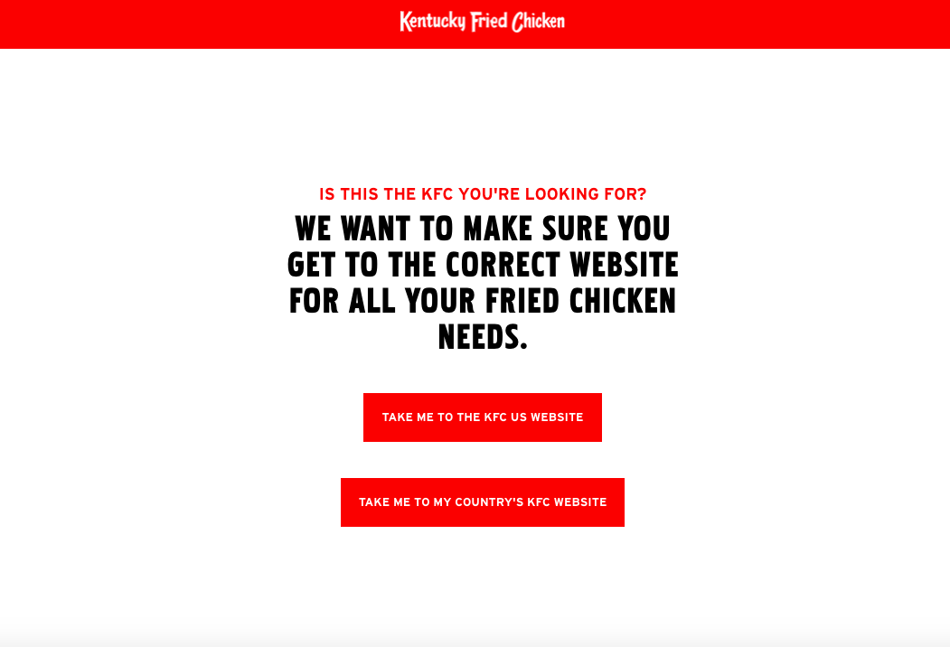
You’ve seen this a lot of times: when you try to access a website of an international company, you face a screen that gives you a choice of versions; for example, here’s what you’ll see when you access the official website of KFC, an international fast-food brand.

Not only the gateway is useful for the visitor because they can access the content in their own language, but also the UX writer did an incredible job by making it fun (how cute “We want to make sure you get to the correct website for all your fried chicken needs” is, agree?).
If there’s no UX writer in your team, you can always hire a translation or a localization expert to make sure that your visitors have no problem with understanding navigation when using your digital products.
Expert Tip: don’t redirect a visitor to a localized website automatically. Better give them a choice of a country suggested on their location, just like KFC does. You never know, a visitor may not prefer the website of the country they’re in.
Localization Implications: Apps
Now let’s talk about what to keep in mind when localizing an app. Below, you’ll find a list of tips to create a totally localizable app that your international customers will have no problems with.
1. Your code is critical for proper localization
The main purpose of localization of an app is to change your code to pave the way for making it easy to understand by translators and international users.
In other words, your code should be able to load content from a wide range of files representing the supported locales, change between various settings and content depending on the locale selected by the customer, and provide support for content with differing formats, lengths.
2. Add support for more locales by creating directories and resource files (Android)
If you’re an Android developer using the SDK tools, they will create a res/ directory in the top project level. It will contain subdirectories for different types of locale-specific resources. To support as many locales as possible and maximize the number of potential users, your app has to:
- Identify and declare text direction within formatted messages
- Use an RTL UI layout for RTL locales.
To do this, you should create additional subdirectories within res/ so your app supports more locales. This is the format required for each of the subdirectories:
<span class="s1"><resource type>-b+<language code>[+<country code>]</span>
Let’s assume that a subdirectory has string resources for locales with the code for the French language marked as FR. The country code is FR and the language code is fr, and if your team agreed on adding the support of the French language, you can create an appropriate subdirectory in res/ as well as files.
MyProject/

    res/

       values/

           strings.xml

       values-b+es/

           strings.xml

       mipmap/

           country_flag.png

       mipmap-b+fr+FR/

           country_flag.png
And now the resource files for this language.
French string (fr locale), /values-es/strings.xml:
<resources>

    <string name="hello_world">Bonjour le Monde!</string>

</resources>
Creating these resource files for each supported locale will ensure that your app users’ native language will be supported.
3. Focus on strings
Before the translation and localization processes begin, you need to make sure that you did the following things with the strings:
- Provide comments with explanations for strings. This will help you to save time and effort during translation because you and others will have fewer cases of misunderstanding and confusion
- Avoid hard-coded strings. Again, this will also make your work much easier; you can do so by carrying out pseudo-localization to identify them
- Do your best to avoid string concatenation. While this sounds good for space-saving purposes, concatenations can lead to translation errors during the localization process because of different word order etc., so avoid them at all cost.
You can read more about Android app localization in this official training lesson, Supporting Different Languages.
Web designers and developers must support the expectations of end users of their products, and localization is a great way to achieve that. However, to ensure quality localization, one needs to keep in mind potential localization requirements before starting to build a digital product.
Hopefully this article was helpful to you to understand the importance of designing with localization in mind and making design localization an easier task.
Need help with localizing your website or app? Get in touch

The things that decide a mobile app's success or failure
With growing desires in numerous sectors, mobile apps are developed to a larger extent. Today, App Stores and Play Stores are flooded with...


