How to convert a web app into a mobile app
Today, we can see the use of different kinds of applications or software for accomplishing various business tasks. From managing inventory of a...
4 min read
Anurag : Apr 13, 2020 11:56:18 AM
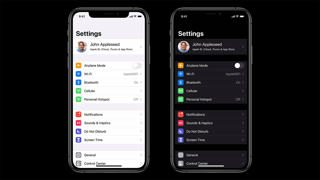

Apple introduced Dark Mode to macOS with macOS Mojave and since then developers and users alike had been pinning for this in iOS as well. And Apple delivered. iOS 13 brought along a system-wide dark mode to iOS devices. And you have to agree, dark mode suits iOS well!
Apart from the appealing color scheme, it has its own set of advantages as well. Dark mode helps preserve battery life on OLED screens. It also strains the eyes less compared to the default mode.
With the introduction of Dark mode in iOS 13, Apple also made it possible for app developers to support this mode in their apps - which brings us to the purpose of this post today - things you need to take care of when planning to enable Dark mode support in your iOS app for iphone and ipad.
You must keep some things in mind before diving into the code or the design. These are the requirements to make your app dark mode native compliant
- The app must use Xcode 11
- It must be run on a device with iOS 13.0 or newer
If you used an older version of Xcode to build your app, it will display in normal mode, even when the device running the app supports dark mode. The same goes for apps running on iOS versions prior to iOS 13.0
Generally if you turn dark mode on in your iOS device, it is automatically switched on for all Apple apps and system settings app UI elements. At this stage, any app will fall under one of the three categories of apps
If your app is not in the first category, don't worry, it is relatively easy to add support for a switch to dark mode in your app. We will not get into the coding part of it, but here's what you'll mostly be working on
Trait collections are not new, they have been around since iOS 8! A traitCollection property provides information about the iOS interface to you - device type, display scale, size class etc. With iOS 13, a new userInterfaceStyle was added which gives you the view's appearance information. This can have any of 3 values
The interface style is passed along to each view in the hierarchy which tells the view which appearance should (but not necessarily) be used. You can override the system's appearance mode wherever you want - so while one view controller supports dark mode, there can be another which doesn't.
To override the userInterfaceStyle passed down from the system, use the overrideUserInterfaceStyle property in your UIView or UIViewController
This includes system colors, semantic (action-based) colors and your asset catalog.
Till before iOS 13, colors were always the same. Starting iOS 13, UIColor objects can now be dynamic, governed by the environment. They can now contain 1 RGB value for light mode, and another for dark mode. When the user changes the device's appearance, UIScreen's traitCollection is changed and all UI objects in the hierarchy are notified. Any control having dynamic colors will be updated.
Apple has also made changes to semantic colors (or UI Element colors). Some examples of them include UIColor.label, UIColor.secondaryLabel. Using these instead of specific colors ensures that the color used in your label in light or dark mode will be the same as the color used in system labels, thus making your app feel native. This is highly important for a great user experience.
You can also add color sets in your Asset catalog. These color sets can be used in code or xib files. Color sets in Asset catalog let you define separate colors for light mode and dark mode.
Just like color sets, you can now add dynamic images with iOS 13. And there are multiple ways to do this
Just like you can add separate color sets for light and dark mode in your Asset catalog, similarly you can have separate images for light and dark mode. This is pretty simple to do - just drag-drop the correct image for each appearance.
SF Symbols are a vast collection of around 1500 highly configurable images Apple introduced at the 2019 WWDC. They are available on all devices running iOS 13. The good thing about these symbols is that they are configured to adapt to light and dark modes automatically, along with different scales and weights (light, regular, semibold, medium sized, large sized etc). SF Symbols can be used in both XIBs and in code.
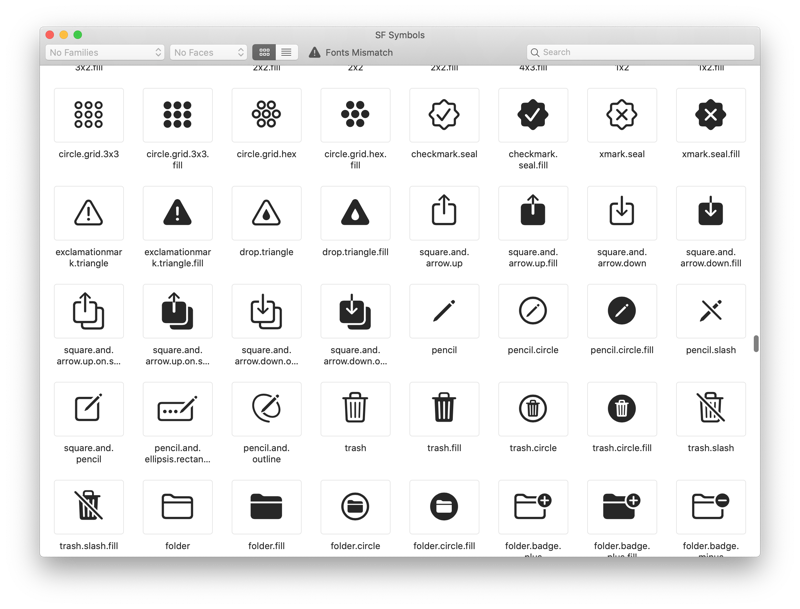
Apple has also created an SF Symbols app to easily refer the available images since the list is pretty exhaustive.
This is something you should be extra-careful about if you use attributed texts in your app. With attributed texts, the foreground of a text is automatically set to BLACK if you don't specify a value. But with iOS 13 and dark mode, this can mean disaster if you fail to address this. Use UI Element colors to your advantage in such cases.
Not every app might be well suited to work with the dark theme (although we highly doubt it, but you never know!). Or maybe you don't really have the time to add dark mode support to your app just now. Or maybe your color scheme is better suited for light mode ONLY. Thankfully, it is easy to disable dark mode for your app.
However, Apple strongly suggests that you add support for dark mode in your apps. So if you are struggling to do this in your app OR don't have the time, you can always hire a good technology partner to take care of it for you!
Need help with your app? Get in touch.
Today, we can see the use of different kinds of applications or software for accomplishing various business tasks. From managing inventory of a...

Using an app and designing an app are completely different things. If an app is designed well, you won't notice the design because you'll be too...

Do you want to create a mobile app but you don't know how to start? Here you have a guide with the keys to know the variables that affect your...