4 Trends in Big Data Innovation Governing the Future of Data Science
Big Data innovations have been consistently increasing over the time. With every year there is improvement in the sector. When we consider 2016 for...
As Economist Ronald Coase puts it, “if you torture the data long enough, it will confess.” That’s what Data Visualization does but with the tools available today, it does it quickly. Data Visualization helps in getting an insight into data. It changes big boring data into a visually colorful storytelling. With the amount of data being generated every second, it is vital to envisage the data to trace trends, outliers, patterns and interact with it to make informed decisions. The need for Big Data visualization tools can be deduced from the fact that the global Business Intelligence and Analytics Software Market is expected to grow from $17.90 billion in 2014 to $26.78 billion by 2019, at a Compound Annual Growth Rate (CAGR) of 8.4%. The reason for its popularity is that it is easy to understand data visually contrary to understanding it through spreadsheets or numbers.
Want to know more about Big Data. Download our free eBook to know everything you need to know about this technology.

Below are some tools of Big Data Visualization which can help in speeding up the process of comprehending large and complex data:
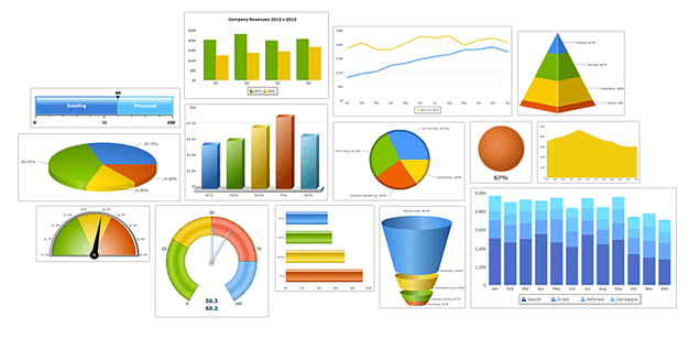
FusionCharts is a part of InfoSoft Global, which is a software provider of data visualization products. It is used over 80% of Fortune 500 companies. The idea of FusionCharts came to a 16-year-old Pallav Nadhani in 2001, who while completing his school assignment found himself dissatisfied with Microsoft Excel charting capabilities. The charts come with default modes and it claims that the very first chart can be created within 15 minutes. It comes with Extensive Docs, Ready to use dashboards and personalized Tech Supports. It gives more than 90 charts and graphs, right from the simple one to the more advanced ones like Funnel, Heat, Map, Zoom Line, Multi-Axis and Treemap Charts.

QlikView is a product of Qlik, a software company based in Radnor, Pennsylvania, United States. QlikView is one of the fastest growing Business Intelligence and Data Visualization tools which is easy to engage with. It provides Associative Search which makes decision-making uncomplicated. Its Associative Experience lets you focus on the most relevant data, whenever and wherever you require. It provides a real-time collaboration with co-workers and partners, a comparative analysis of data, lets you combine your pertinent data into a single app and makes sure that the right people of the organization have access to the information, through its reliable security features.

Tibco Spotfire is an analytics and business intelligence platform which gives you a quick insight into your data. It is available in Desktop, Cloud and Platform Editions. It has an AI driven recommendation engine which dramatically shortens data discovery time. Its feature of Data Wrangling helps you to quickly spot data outliers, inconsistencies, and deficiencies. During 2010 World Cup, FIFA used the software to give viewers analytics on country teams’ past performances. Spotfire power users include Procter and Gamble, Cisco, NetApp, Shell.
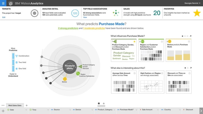
Watson Analytics is IBM’s cloud-based analytics service which helps you to quickly find insights in your data. When you upload your data on Watson Analytics, it shows you the questions it can help you to answer and then provides you with data visualizations instantly based on it. You can explore your data through natural language processing too. Its other key features include automated predictive analytics, one-click analysis, smart data discovery, simplified analysis, accessible advanced analytics, self-service dashboards. Watson analytics also enables cognitive computing which in turn brings more insightful information from the data.

It’s easy to use interface imparts a hassle-free operation to the non-techies. It does an ad-hoc analysis of high volume data and enables to gather information from all your sources into a single and accessible repository, thus making it a single platform managing the entire Business Intelligence workforce. It can also analyze data in real-time. For example- If during the peak season, the trends in sales have to spotted, it can provide a great insight into the vast amount of data quickly which can be traced as it occurs. The popular customers include eBay, Merck, NASA, ESPN, SONY.
Tableau makes you see and understand your data by combining data from multiples sources in few clicks. Through this you can create interactive and flexible dashboards making use of custom filters and its drag and drop functions. Tableau claims to work naturally with the way you think- Ask questions, change perspectives and reveal the meaning. It is available in desktop, online and service editions. You can share your data and dashboards quickly with Tableau online and Tableau server. It also has a plentiful of online video tutorials which make it easy to use, especially for the non-techies.

Datawrapper is easy to use tool for creating visualizations like infographics, maps, data tables and responsive charts like line, bar, stacked bar, donut, etc. Its use it popular among publishers and journalists. The popular users include The Washington Post, The Guardian, Buzzfeed, The Wall Street Journal. Its very easy to use and need not be a coder to use it.
8. Microsoft Power BI
Microsoft Power BI is a business analytical tool which makes it easy for businessmen to visually analyze their data and form strategies based on it. It provides an access to on-premise and in-cloud data. It has two pricing plans, out of which one can be acquired for free. The free one comes with 1GB data limit, allows you to create, make and share dashboards and reports. The Power BI Pro has all power BI features, can consume live data with full interactivity, share data queries through the Data Catalog and much more.
Infogram is a data visualization and infographic company founded by Uldis Leiterts, Raimonds Kaže and Alise Semjonova in 2012. It lets you choose from more than 1 million images to make infographics. It makes accessing data easy by letting you edit the data in the editor and connect to your desirable cloud service. Some of its users are Deloitte, Nielsen, Skyscanner, and MSN. It’s easy to use steps makes the educators, journalists and business professionals to conveniently visualize their data. It has created over 4.8 million infographics, that are viewed by over 500 people every month.

Plotly or Plot.ly is a data visualization tool with the company's headquarters in Montreal, Quebec. It lets you make interactive charts, presentations, and dashboards. Plot.ly has a graphical user interface for importing and analyzing data into a grid and using stats tools. It uses web native D3.js for all of its graphics. It makes dashboards easy to create by Excel users, SQL database connectors, Python, R, and MATLAB.
.png?width=311&name=Plotly_logo_for_digital_final_(6).png)
Visualizing Big Data can help companies glean new insights and form strategies which can bring profits and make them understand their clients . As Jonsen Carmack rightly says, “Both data visualizations and infographics turn data into images that nearly anyone can easily understand- making them invaluable tools for explaining the significance of digits to people who are more visually oriented.”
We at NewGenApps specialize in making sense out of large data sets both curated and non-curated. If you are looking for a company to give you insights that matter for your business then feel free to contact us.

Big Data innovations have been consistently increasing over the time. With every year there is improvement in the sector. When we consider 2016 for...
A group of large data sets that cannot be processed using traditional computing techniques is known a Big Data. In the processing of Big Data...
